Exploring the Amusing World of Book Covers
Exploring the Amusing World of Book Covers: Each One Telling (Sometimes Not Telling) A Tale Of Its Own

How many times have you held a book and been fascinated by the design of its cover page? And I am sure there must be times when you wondered what prompted the author to choose this design for the cover page. Similar to the vastness of literal diversity of the texts written over the years, we often witness the artistic diversity of cover pages designed for these texts.
Such is the appeal of these cover pages that, just like the texts enclosed within them, the cover page designs make us laugh, cry, and sometimes amaze us with their exclusiveness (or the lack of it). So today, let us explore this beautiful world of book covers.
Variety of Covers For A Variety of Books

The trend of designing cover pages of books dates back to ancient times. Perhaps the need to add an artistic appeal to the text was prevalent among authors even then. With the evolution of time, the designs became more versatile and myriad. The authors started experimenting with design ideas generally relevant to the text. However, some authors opted for cover page designs that seemed to have been selected by them with their eyes and minds closed. Thankfully, this proved to be a boon in disguise. It gave birth to diverse book cover trends, which were equally entertaining as the texts they covered. Some of these trends gained such popularity that the authors began to use them extensively. And then some other trends, to put it mildly, died a silent death!
Cover Page Trends We Love
I think you will agree with me when I say that the cover page of a book adds to its appeal. And if you do not mind flaunting your love for reading, you may even use a book with an exciting cover page as an impressive decor item. Now, let’s learn more about the design trends that have won the hearts of countless authors and readers over the years.
The “Vintage Charm” Cover
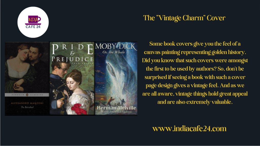
Some book covers give you the feel of a canvas painting representing golden history. Did you know that such covers were amongst the first to be used by authors? So, don’t be surprised if seeing a book with such a cover page design gives a vintage feel. And as we are all aware, vintage things hold great appeal and are also extremely valuable. So, cherish any books in your collection with canvas painting cover pages, as they might prove priceless. Classics like “Pride and Prejudice“- are a perfect example of Vintage cover.
The “Glamour Shot” Cover
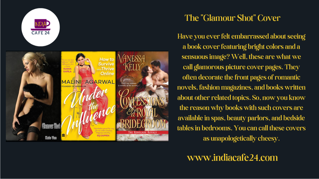
Have you ever felt embarrassed about seeing a book cover featuring bright colors and a sensuous image? Well, these are what we call glamorous picture cover pages. They often decorate the front pages of romantic novels, fashion magazines, and books written about other related topics. So, now you know the reason why books with such covers are available in spas, beauty parlors, and bedside tables in bedrooms. You can call these covers as unapologetically cheesy.
The “Genre Stereotype” Cover
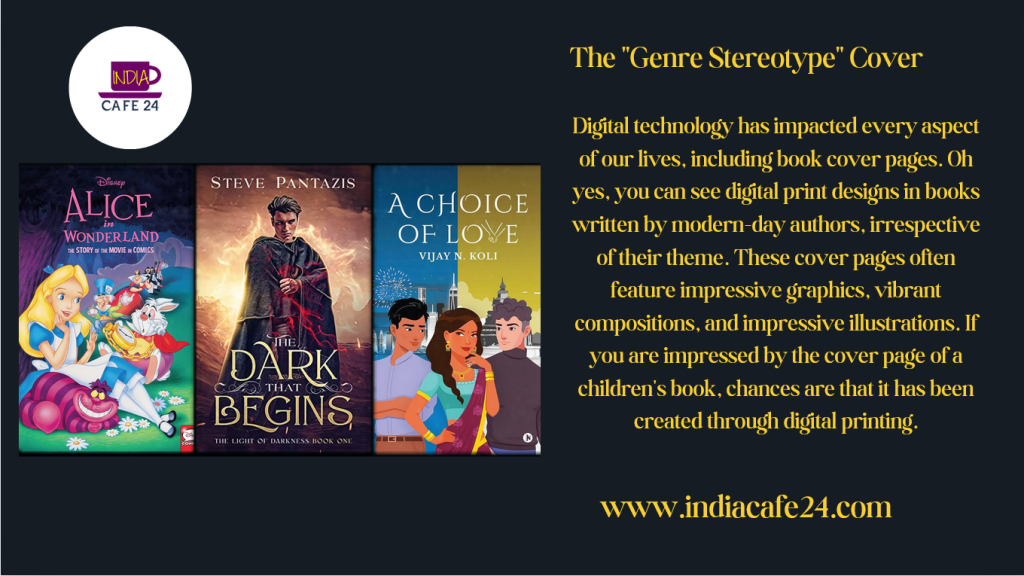
Digital technology has impacted every aspect of our lives, including book cover pages. Oh yes, you can see digital print designs in books written by modern-day authors, irrespective of their theme. These cover pages often feature impressive graphics, vibrant compositions, and impressive illustrations. If you are impressed by the cover page of a children’s book, chances are that it has been created through digital printing. However, you might also find digitally printed cover pages with amateur designs. Well, in such cases you won’t be wrong to guess that these creations are made by people having the illusion of being master artists. Fantasy novels you will find featuring dragons, lizards, Snake and mystical landscapes
The “Mysterious Symbolism” Cover
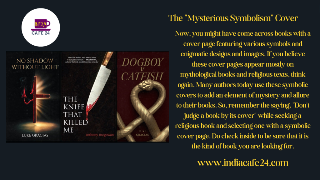
Now, you might have come across books with a cover page featuring various symbols and enigmatic designs and images. If you believe these cover pages appear mostly on mythological books and religious texts, think again. Many authors today use these symbolic covers to add an element of mystery and allure to their books. So, remember the saying, “Don’t judge a book by its cover” while seeking a religious book and selecting one with a symbolic cover page. Do check inside to be sure that it is the kind of book you are looking for.
The “Minimalist” Cover
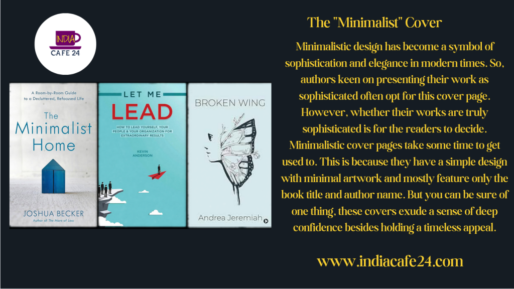
Minimalistic design has become a symbol of sophistication and elegance in modern times. So, authors keen on presenting their work as sophisticated often opt for this cover page. However, whether their works are truly sophisticated is for the readers to decide. Minimalistic cover pages take some time to get used to. This is because they have a simple design with minimal artwork and mostly feature only the book title and author name. But you can be sure of one thing, these covers exude a sense of deep confidence besides holding a timeless appeal.
A Few Parting Words
You can find the above-discussed cover page styles in books across different genres. So, the next time you pick up a book, stop a moment and think about the style of its cover page. You will be surprised by the great fun and entertainment you can get by spending a few moments doing this interesting activity before buying a book.
This post is part of the Bookish League blog hop hosted by Bohemian Bibliophile
This blog post is part of the blog challenge ‘Blogaberry Dazzle’
hosted by Cindy D’Silva and Noor Anand Chawla
in collaboration with Dr. Preeti Chauhan.

Nice. I like classic covers and illustrated ones as well. Some minimalist ones are also good, but most of the times the old world emotional touch adds a lot of appeal.
A minimalist book cover is impressive with its simple typography and a minimum amount of visual elements, such as colors, graphics, and images, which are combined ingeniously enough to suggest the book’s lifeblood.
This was like a brief history and masterclass in book covers. I’m myself a lover of graphic covers and try to use/create those for my own books too, which generally fall under the ‘Genre Stereotype” cover. I also like minimal covers a lot
I do like covers which have symbols from the text. Like for instance “Independence”, the India cover, totally was in keeping with the text. Similary the Partition trilogy by Manreet Sodhi were beautiful and in keeping with the style of the book
I must confess that I judge a book by its cover and its blurb before deciding to pick it up so cover matters.
That said, I do prefer clean pictures that convey something about the storyline.
Minimalistic book covers are sometimes very appealing, using minimal images representing the setting, theme or whatever is suitable and not cluttering with colours, especially the deep ones. I believe the covers should give some indications of the genres rather than the buyer searching for it perusing the pages inside.
Years back I had done posts on book covers for AtoZ so it was great to read a post on similar lines. And, my verdict is minimalistic covers work the best!
Wow!! What a insightful read about the different book covets. I am a big time sucker for vintage covers
What an engaging and insightful exploration of book cover designs! The variety and creativity behind each cover truly reflect the diversity of the literary world. I particularly enjoyed how you highlighted different trends, from the timeless charm of vintage covers to the modern sophistication of minimalist designs. It’s fascinating to think about the thought and artistry that goes into these covers, enhancing our reading experience before we even turn the first page.
This is one of the most interesting non-fiction articles I’ve read in a while. Book covers are fascinating indeed, and your blog with a great list of the different types and their names intrigued me no end. I think I love the minimalist type the most, goes with my personality. I hope I can get one done for my book, if and when I publish it. Thanks again for sharing your knowledge.
Oh wow! Book covers can be a topic for a post!… how amazing is that. Only you can think of it Samata👍.
I don’t have one choice for a book cover cuz I have my favourites in each category, but going by our post, the minimalistic ones caught my eye. If I were given a choice to design, maybe I would come up with something like that😊
Wow, Samata, this was like a masterclass on book covers. I admit, I often choose books based on their cover designs before delving into the story. It makes me wonder about the creative minds behind those intriguing covers and how they influence our reading choices..Thanks for sharing this about book cover.
Very interesting. Thank you for sharing about it. Covers are usually the first thing that attracts us to the book. Now I will cross-check what I read today with the next book I pick.
I always judge a book by its cover. If it doesn’t appeal to me, I don’t pick it up from the shelf. I love all the types that you have mentioned here: glam, classic, genre specific and minimalistic. Not a fan of overtly artificial graphics though. It has to be aesthetically pleasing.
Detailed study on book covers. Minimalist book cover appealing but I personally love graphic one. May be it is in trend now. But love graphic design book covers.
So much goes into the cover. Never thought much into it. A master class indeed.
I had so much fun reading this article – I agree with you, I always look at a book cover before I read the blurb and decide to pick it up… if there is a book with 2 cover options, i tend to pick the one that i ‘like’ more … i know there is a whole science and industry behind this, and it really fascinates me.
As someone who has worked on a fair number of book covers, you had me nodding right through. Have you read The Clothing of Books by Jhumpa Lahiri? It is an interesting discussion on book covers from an author’s viewpoint.
Will check this out for sure
I don’t judge a book by its cover but it sure plays a part in me picking it up. The Vintage Charm is one of my favourite types of covers. Hand painted ones look great too. Minimalist are tad boring, though they work best for business or political content.
For me covers play a very role in making and breaking a book. I sometimes pick up books solely because it had a beautiful cover. An unique topic you have here.
Having worked for many years in the Publishing industry, I understand how much thought goes behind each cover design. I loved reading about the various types and also seeing the pics of books using that particular type of cover. It is an interesting aspect and does draw a reader towards a book. The first impression, as they call it. You’ve chosen a very interesting topic.
I have found myself drawn more towards book having The “Mysterious Symbolism” Cover and The “Vintage Charm” Cover rather than the minimalist covers. I have tried my hand at designing book covers but it is a tough job. Because no matter what, most readers do judge a book by its cover.
I like all types of covers but mysterious symbolism finds my attention first. I have never tried to design any cover but choose books by its cover rather reading the blurb.
we’ve probably wondered what inspired the author to choose that particular design. Just as the literary world offers a rich diversity of texts, the artistic variety of book covers reflects the creativity and thoughtfulness that goes into presenting these works. I sometimes look for cover pages to understand the topic of the book
Enjoyed reading this blog post. Congratulations on winning the Bookish League contest.
Loved your choice of topic Samata. Though I try not to judge a book by its cover, the truth is, it does make a difference on how favourably I look upon a book. Specially when it comes to classics – the vintage covers are so pretty I have ended up buying multiple copies of the same book only for its pretty cover.
I can attest to how much book covers can affect ones decision to get a book through my experience with my daughters. Whenever we’re at a bookstore to get some books, they would always get the ones that has a better looking/interesting/cool cover and sometimes not even knowing what the books is about.haha
Book covers definitely add to the appeal of a book.